Clear Mind Psychology
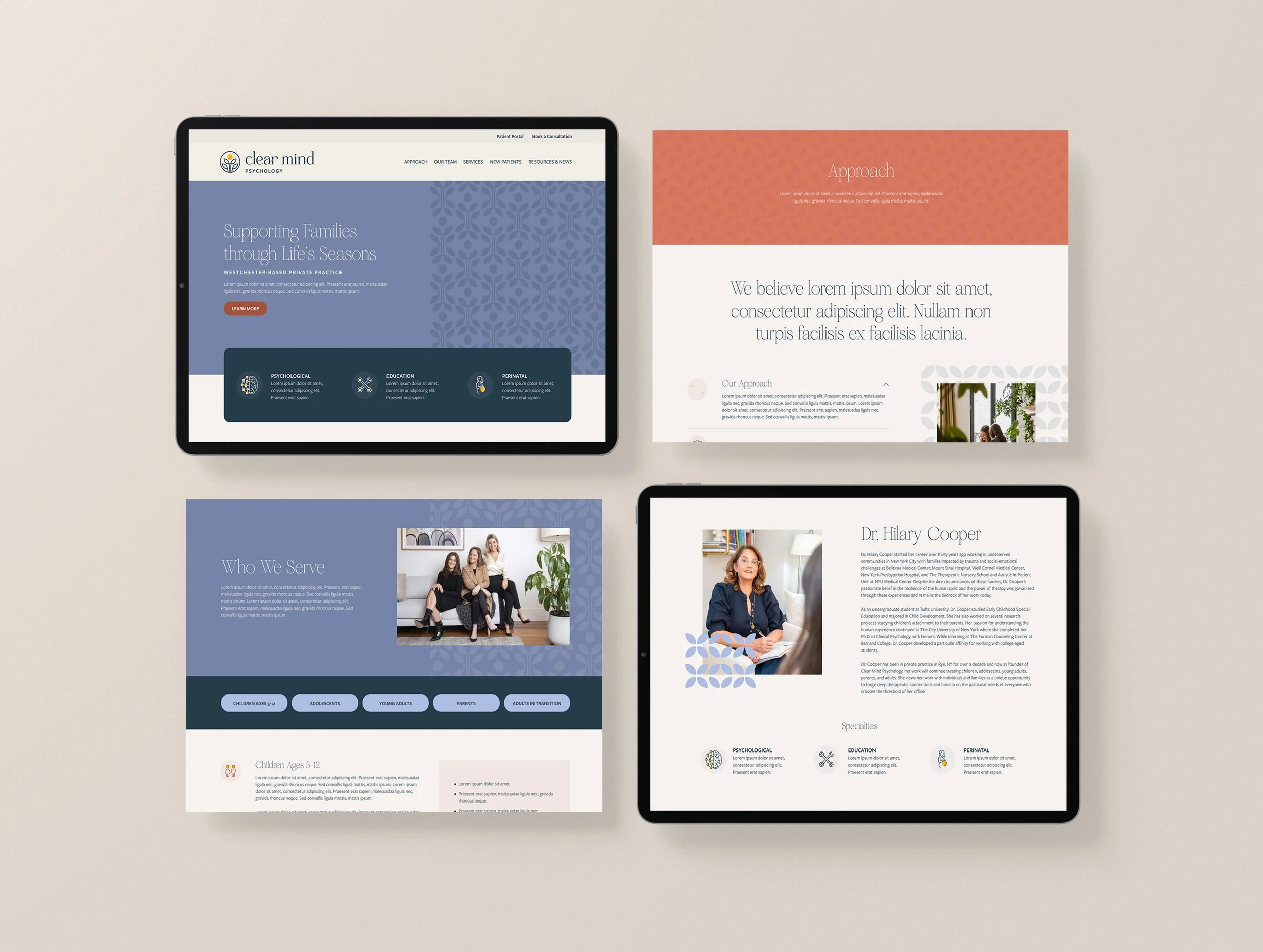
With an established client base and a vision for future growth, Clear Mind Psychology sought a modern and meaningful brand identity and website experience that aligns with their future goals of catering to families in all phases of life.
Created in collaboration with East Taylor Creative | Role: Creative Director & Designer
Logo
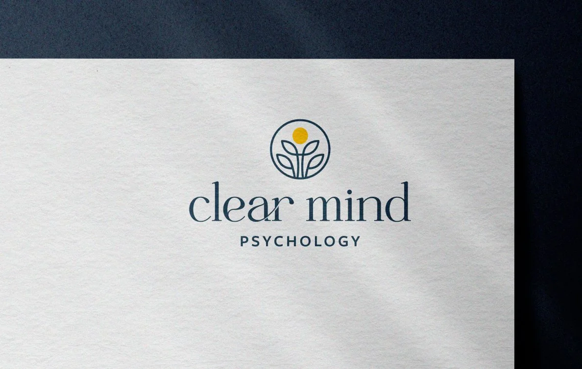
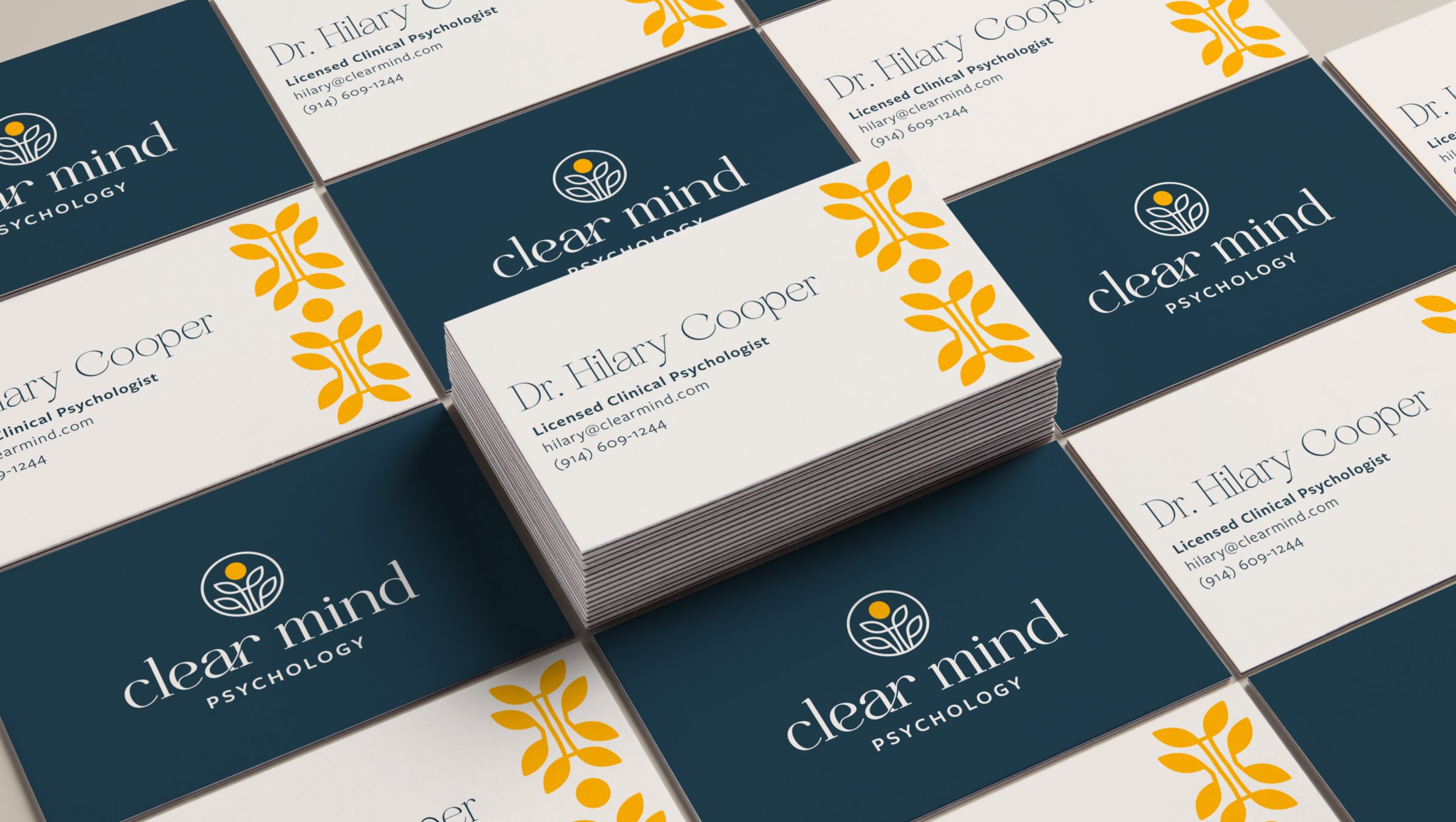
With a mark representing growth and a calm, fluid logotype, the logo as a whole embodies the fundamental principles of Clear Mind Psychology and the notion of life's cycles.
Logo Mark
The mark shows abstract leaves growing to a central light source, representing the growth and hope provided by therapy.
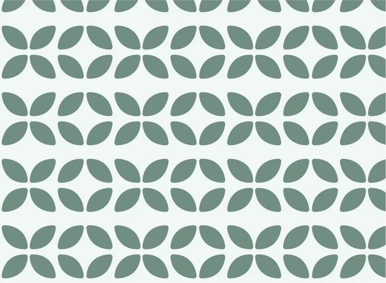
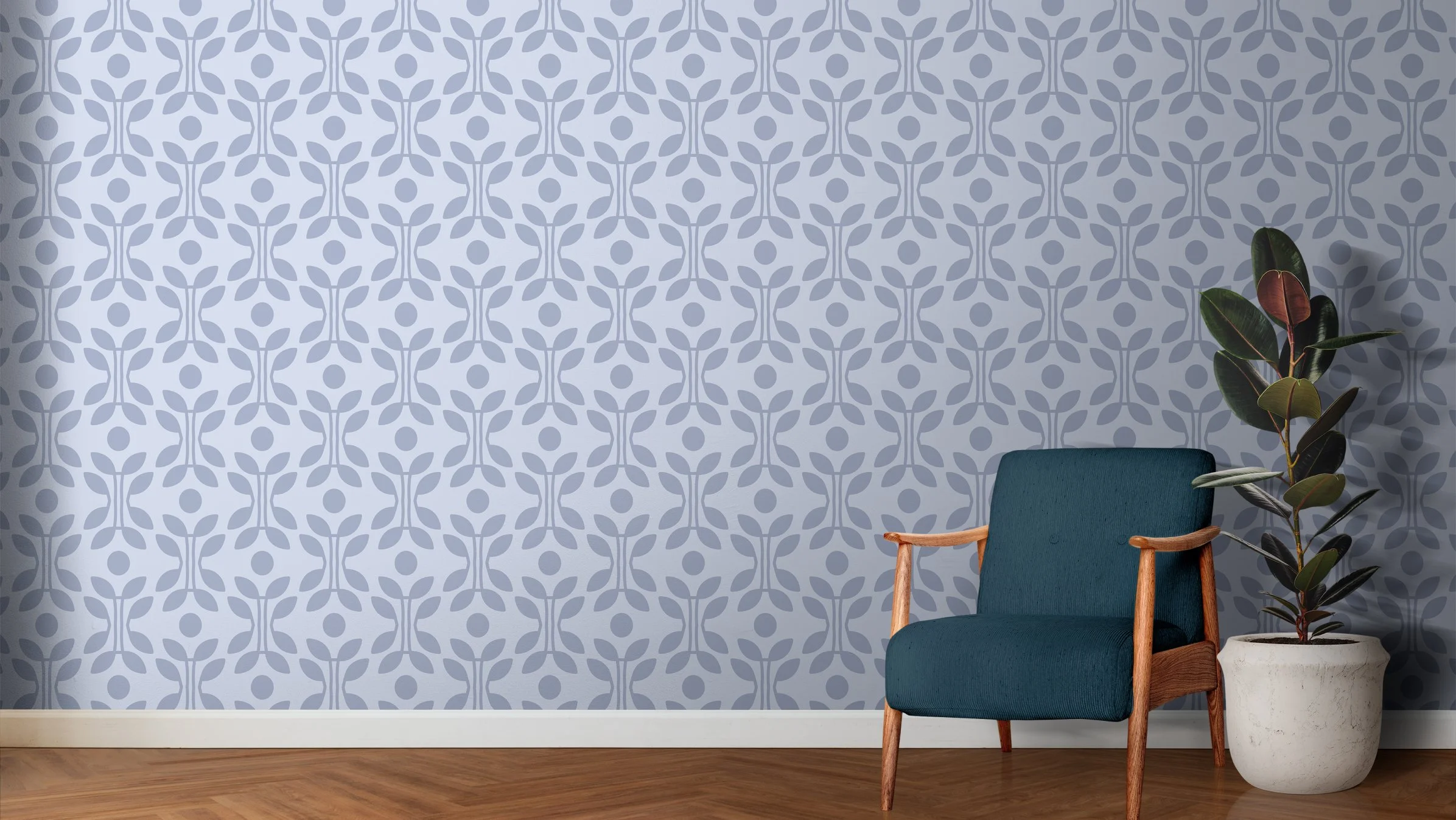
Each brand pattern pulls apart components of the logo mark to create a distinct brand expression.
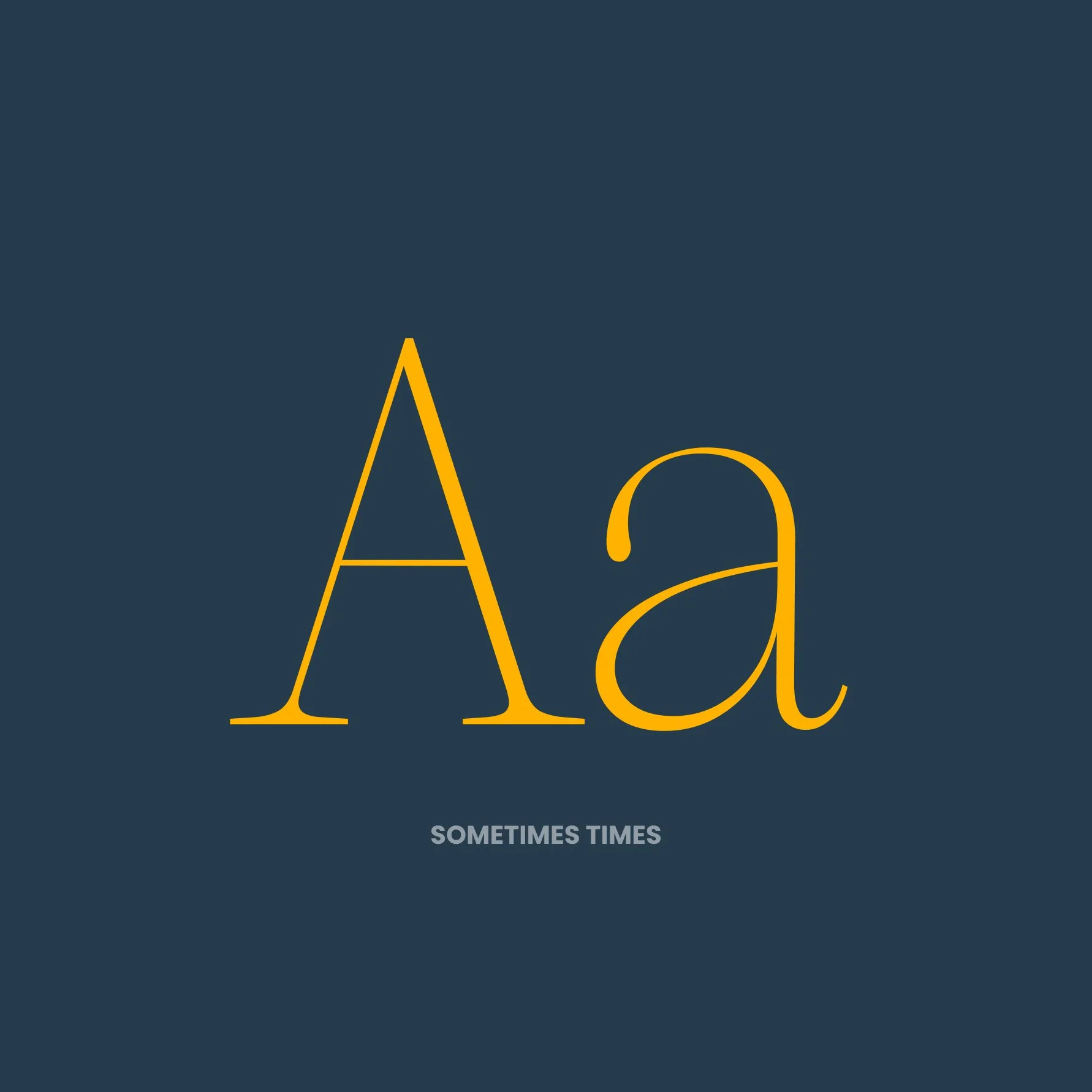
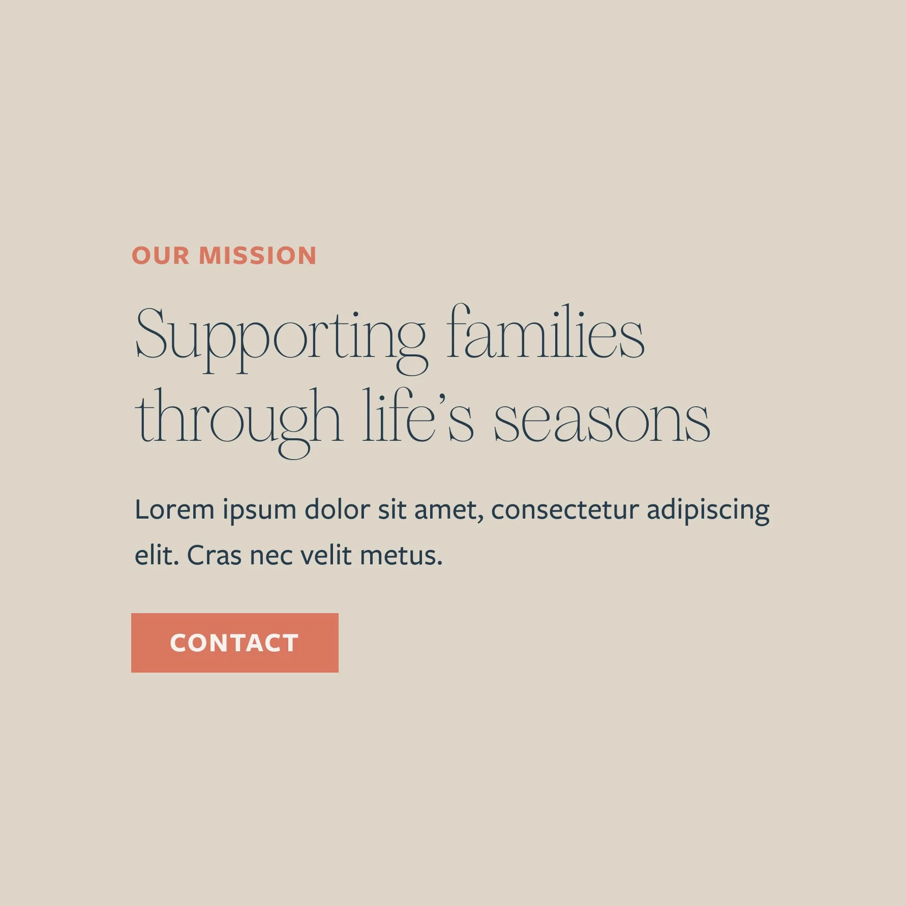
Sometimes Times serves as the brand’s headline font. The elegant serif font is friendly and approachable while maintaining professionalism.
The brand fonts work as a system, pictured above.
