The Southern Conserve
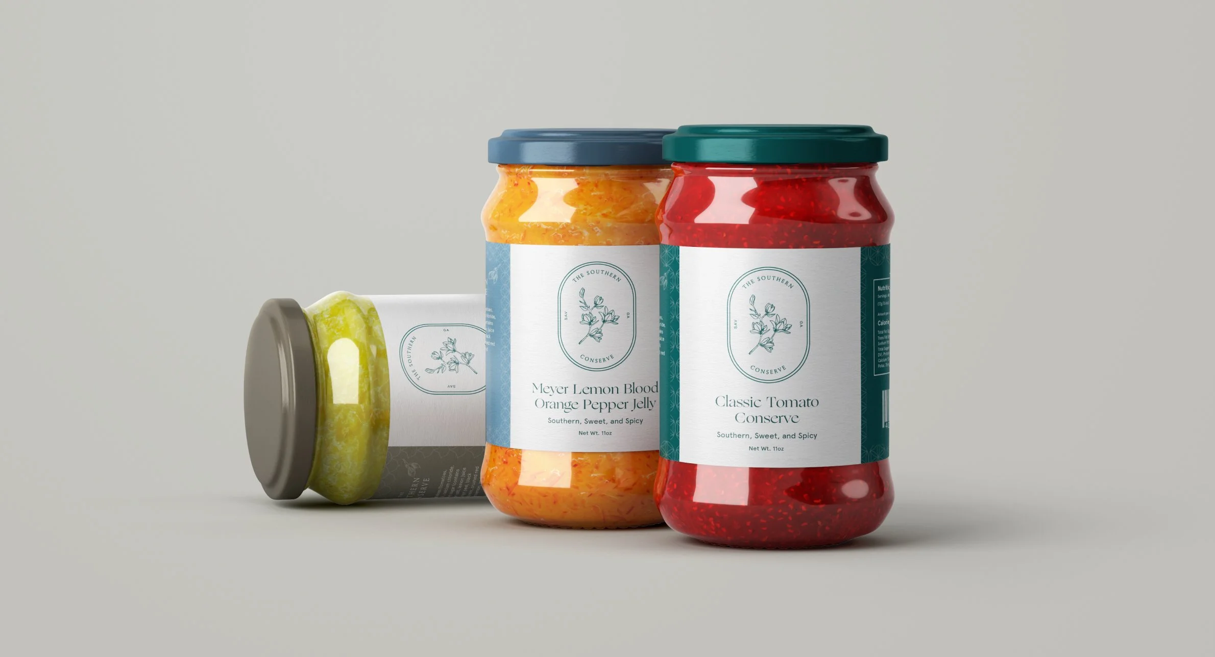
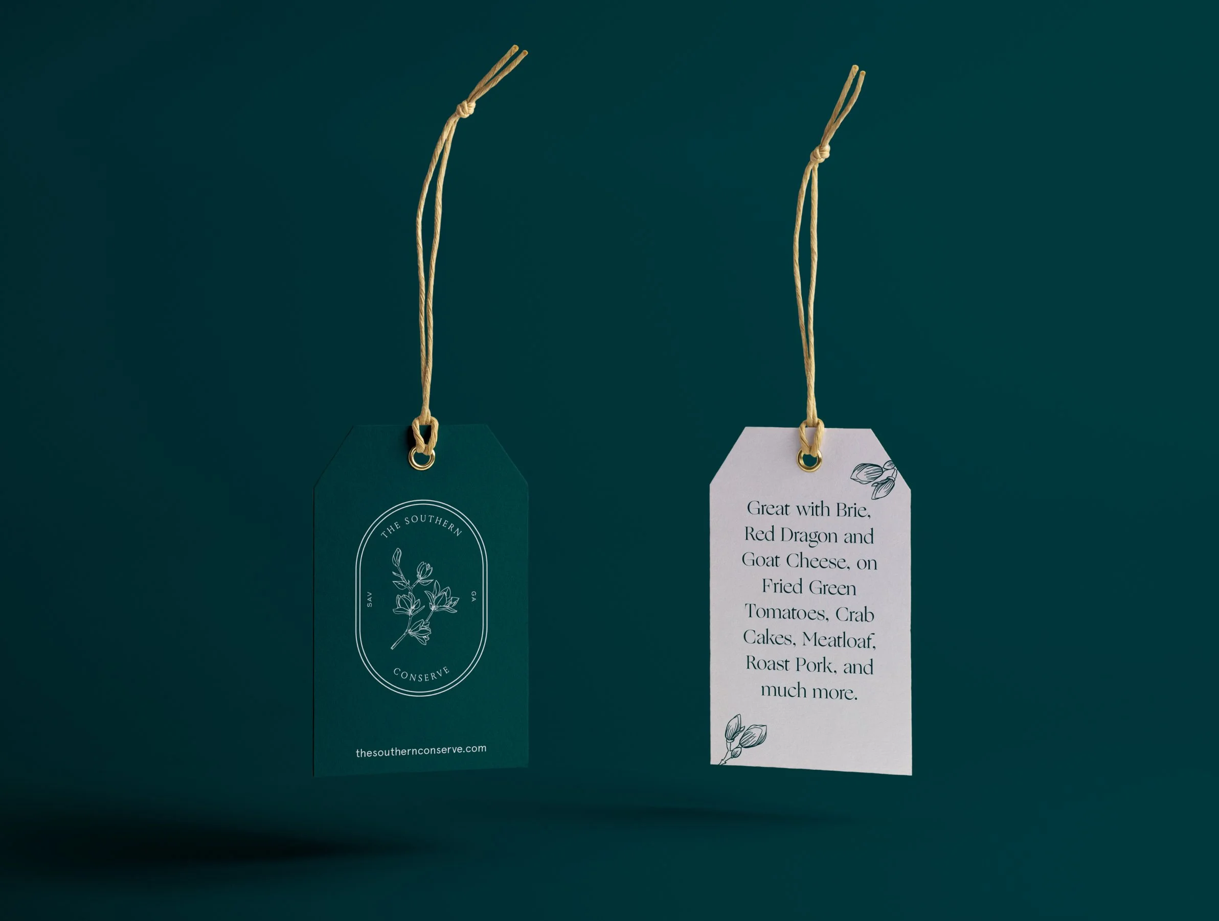
The owners of a café in Savannah, Georgia sought a brand identity to represent their vision for an elegant Southern lifestyle brand encompassing a food product line, home goods, and more.
Created in collaboration with East Taylor Creative | Role: Creative Director & Designer

Primary Logo
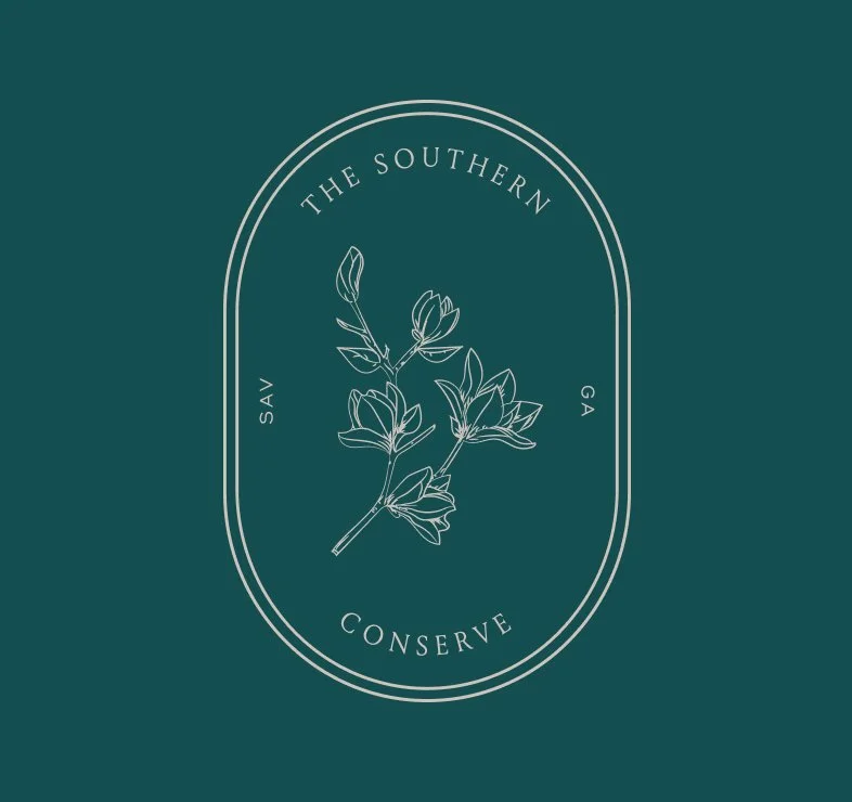
Used frequently and foremost, the linear, stamp-like primary logo features magnolia blooms — a staple of Southern culture.
Secondary Logo
The secondary logo removes all decorative elements and is for use when the primary logo type would be unreadable or not prominent enough.
Tertiary Logo
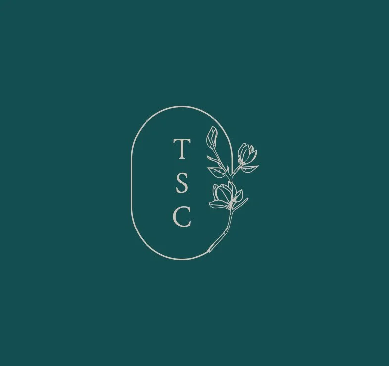
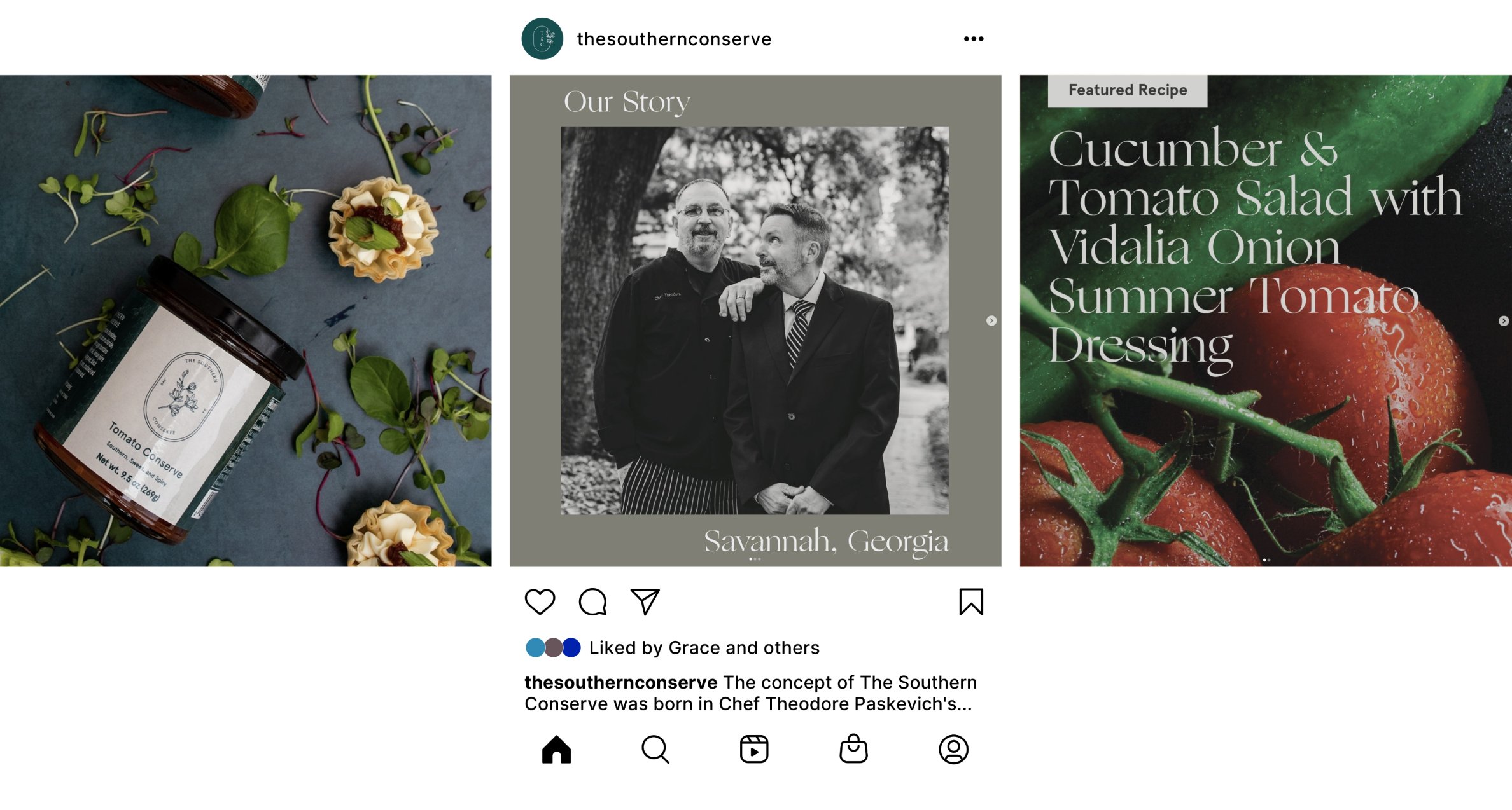
Only for the smallest of instances, like a social profile photo, the tertiary logo hints at the primary logo’s blooms with an abbreviated brand name.
Custom illustrations mimicking the line weight of the primary logo add some playfulness to the brand.
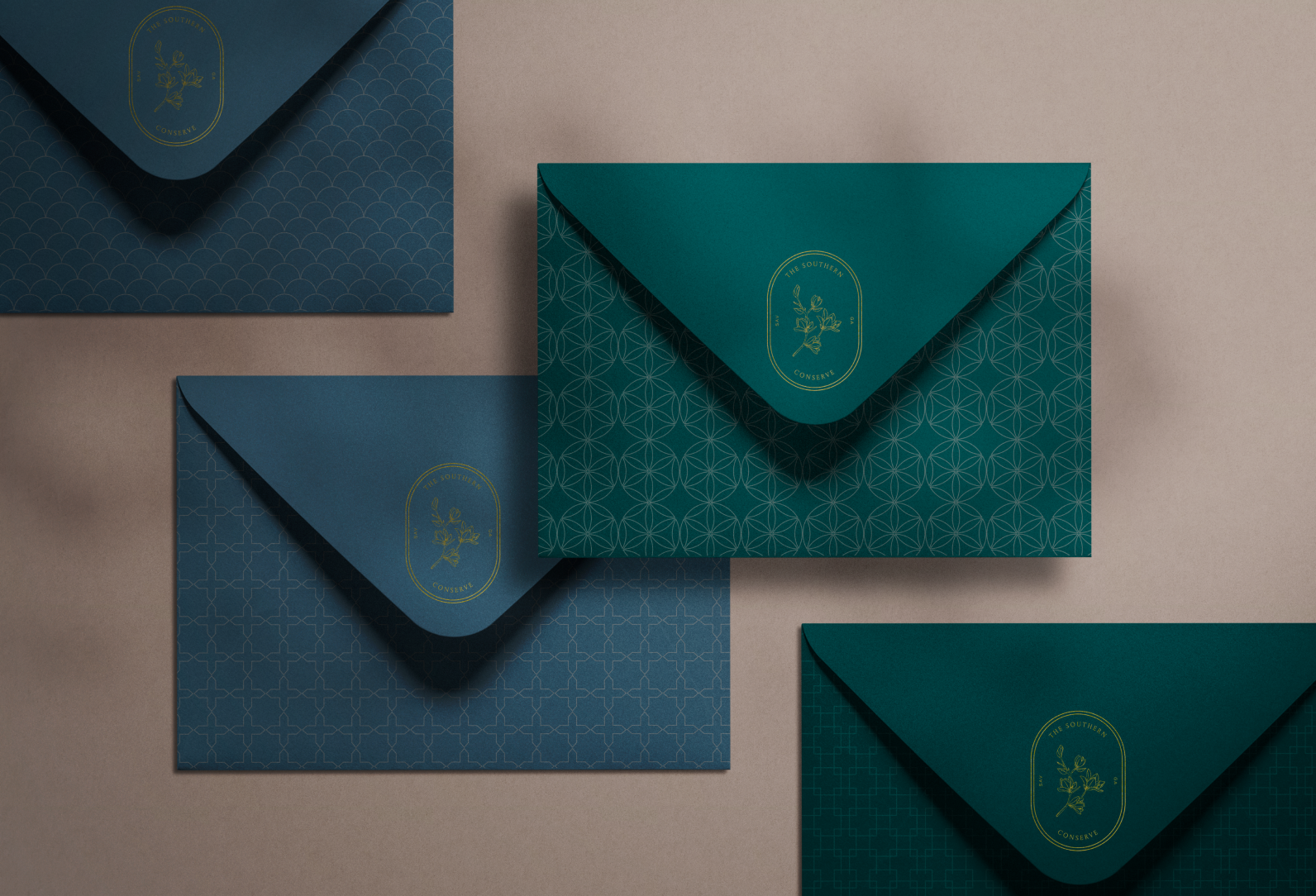
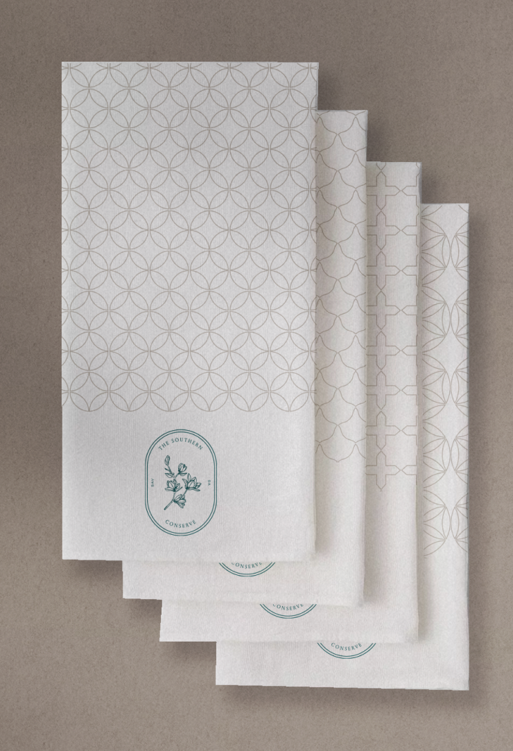
A library of delicate patterns were created to compliment the linear logo and brand illustrations.
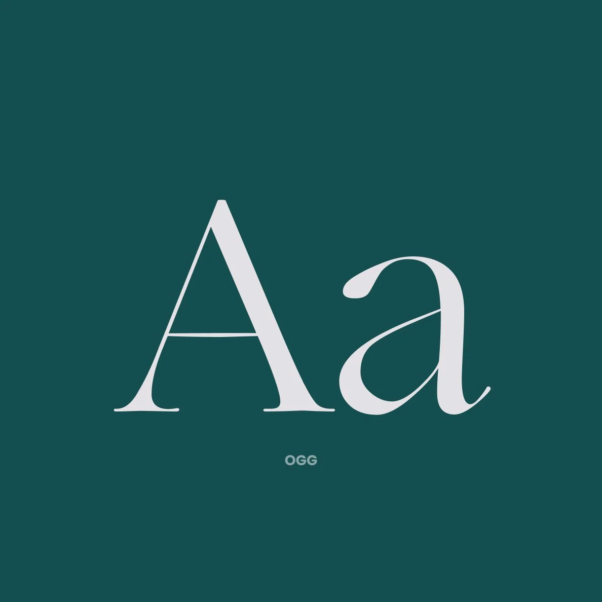
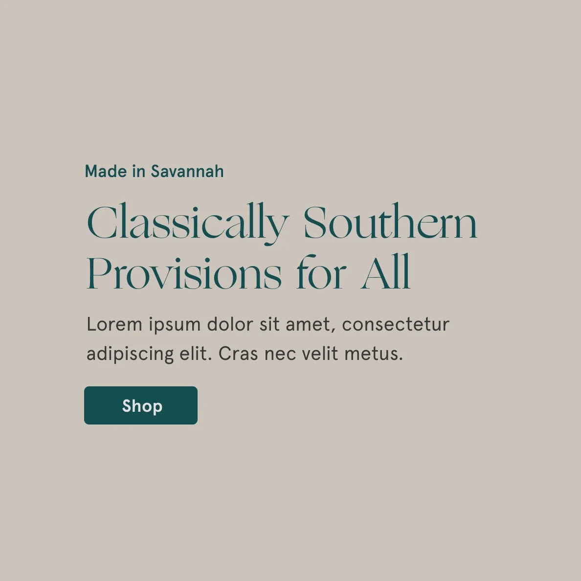
Ogg serves as the brand’s headline font. The serif font is elegant and detailed, just like The Southern Conserve.
The brand fonts work as a system, pictured above.

