Morsel Meals
Flux Nourishment, a plant-based food delivery service based in Savannah, Georgia, came to us seeking a new brand name and new visual identity to carry them in their next phase of growth.
Created in collaboration with East Taylor Creative | Role: Creative Director & Designer
We kicked off this project’s deliverables with a new brand name. Through our discovery work, we landed on a handful of names representative of the brand’s mission, vision, and values. In weighing each name, we looked at what it sounds like and feels like. We landed on Morsel. Along with renaming the brand, we helped identify the brand’s values and brand voice, ensuring the new visual elements would be consistent with the non-visual pieces. All of these elements make up a brand, and through our deep discovery process, we ensure all brand expressions we create are meaningful and long-lasting.
The name was inspired by a comment from Morsel’s founder: “Each piece of ginger is cut with the thought that this is so good for you.” Morsel alludes to each meal being crafted to be filling, fueling, and good for you, down the the last Morsel.
Sounds Like: intriguing, a bite, granular (every morsel/the last morsel)
Feels Like: elevated, intentional
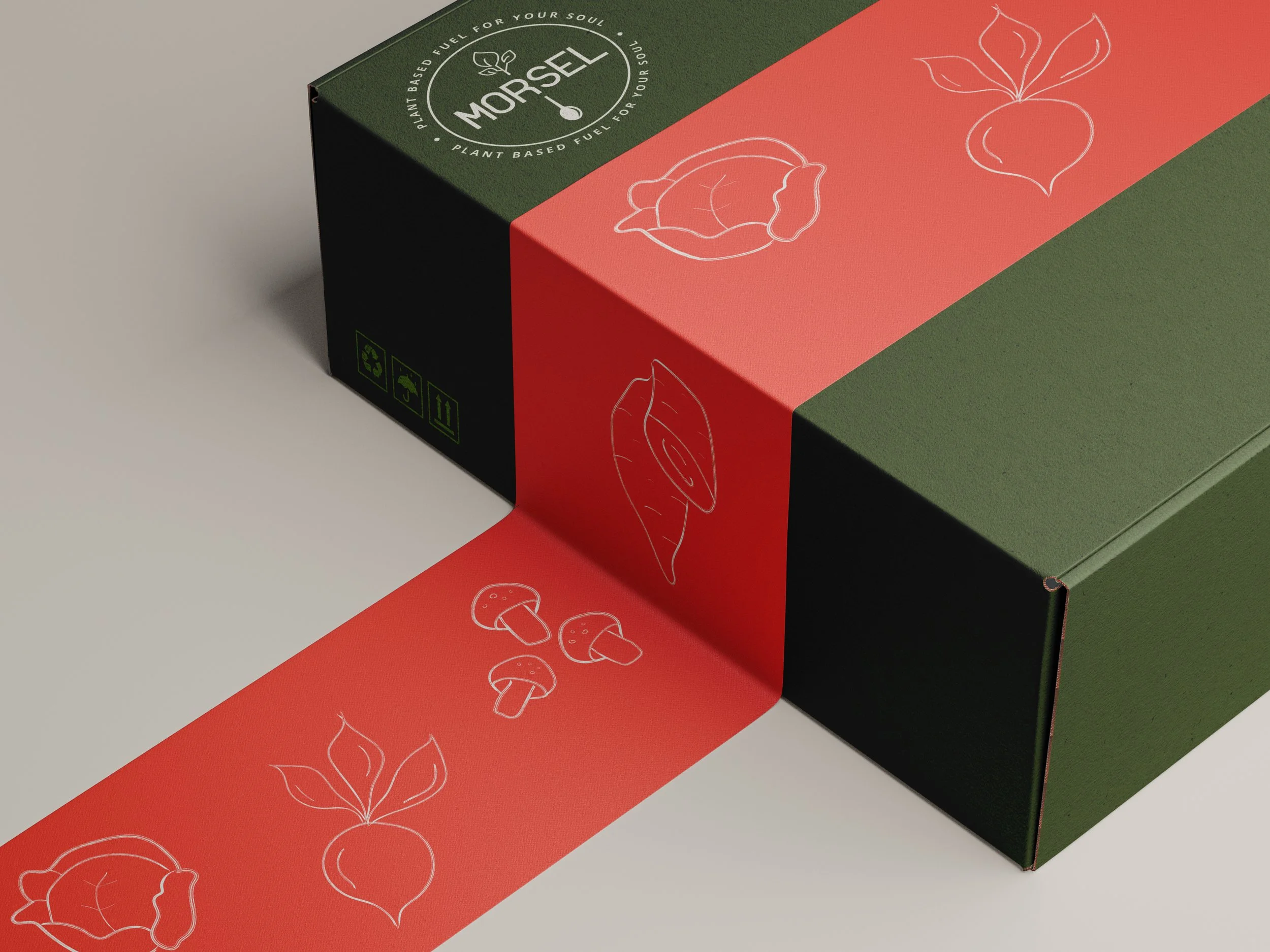
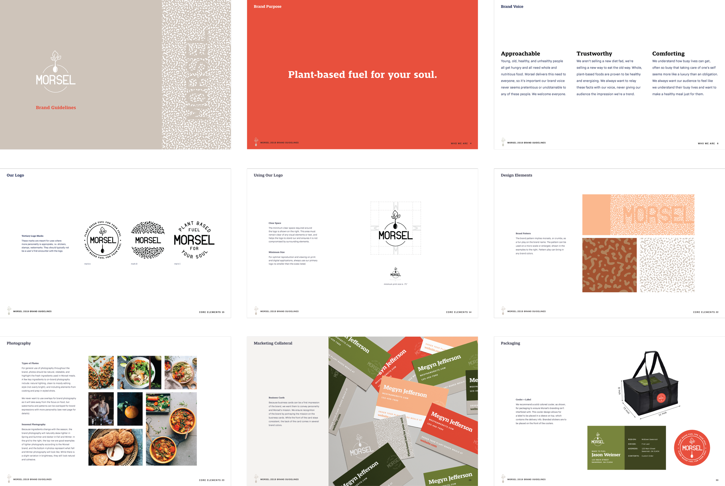
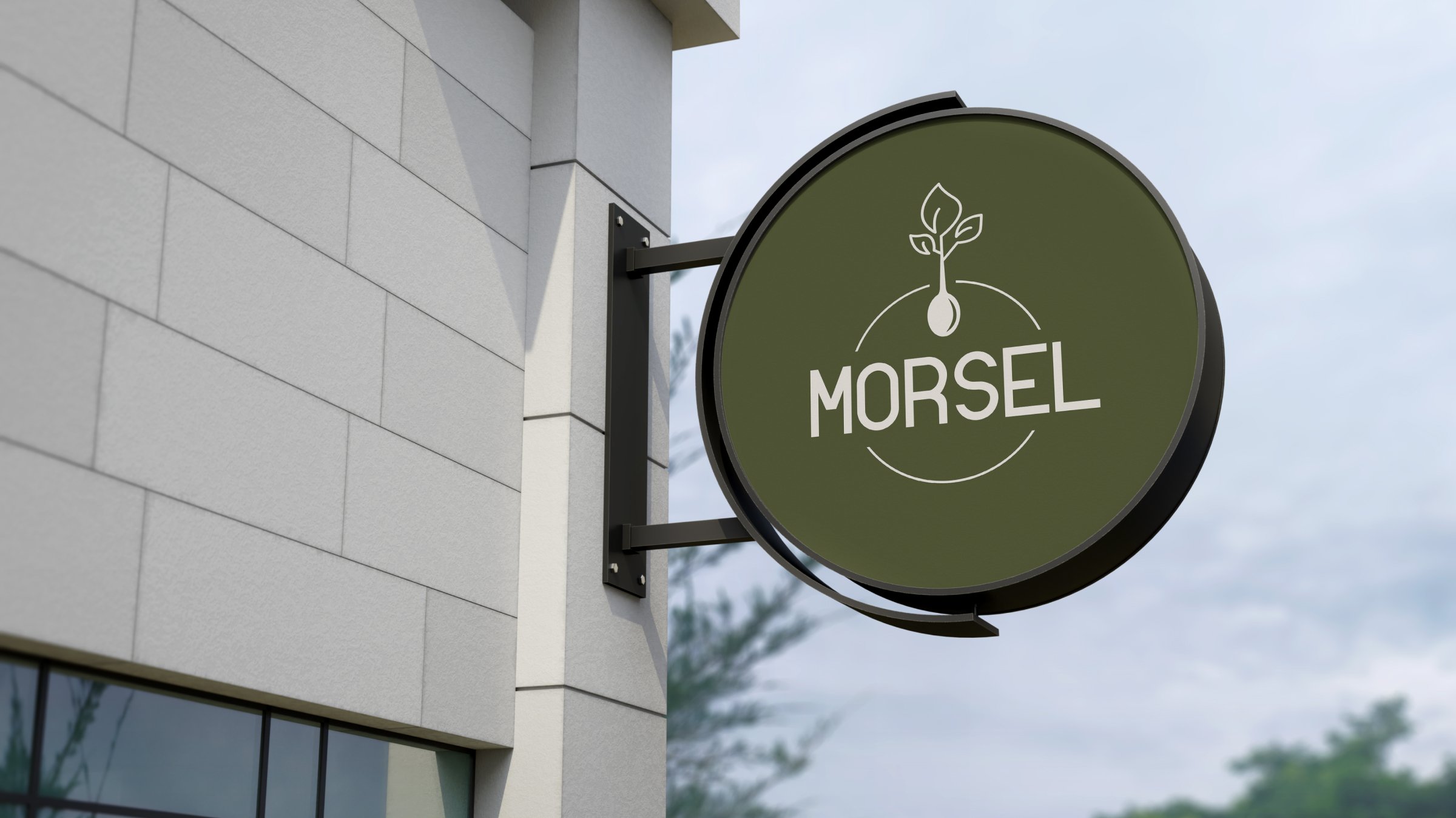
The primary logo mark features a spoon morphing into a plant, representing Morsel’s plant-to-plate approach. The logo system provides a mark for every purpose, bringing in the brand tag line for some expressions and the brand pattern in another.
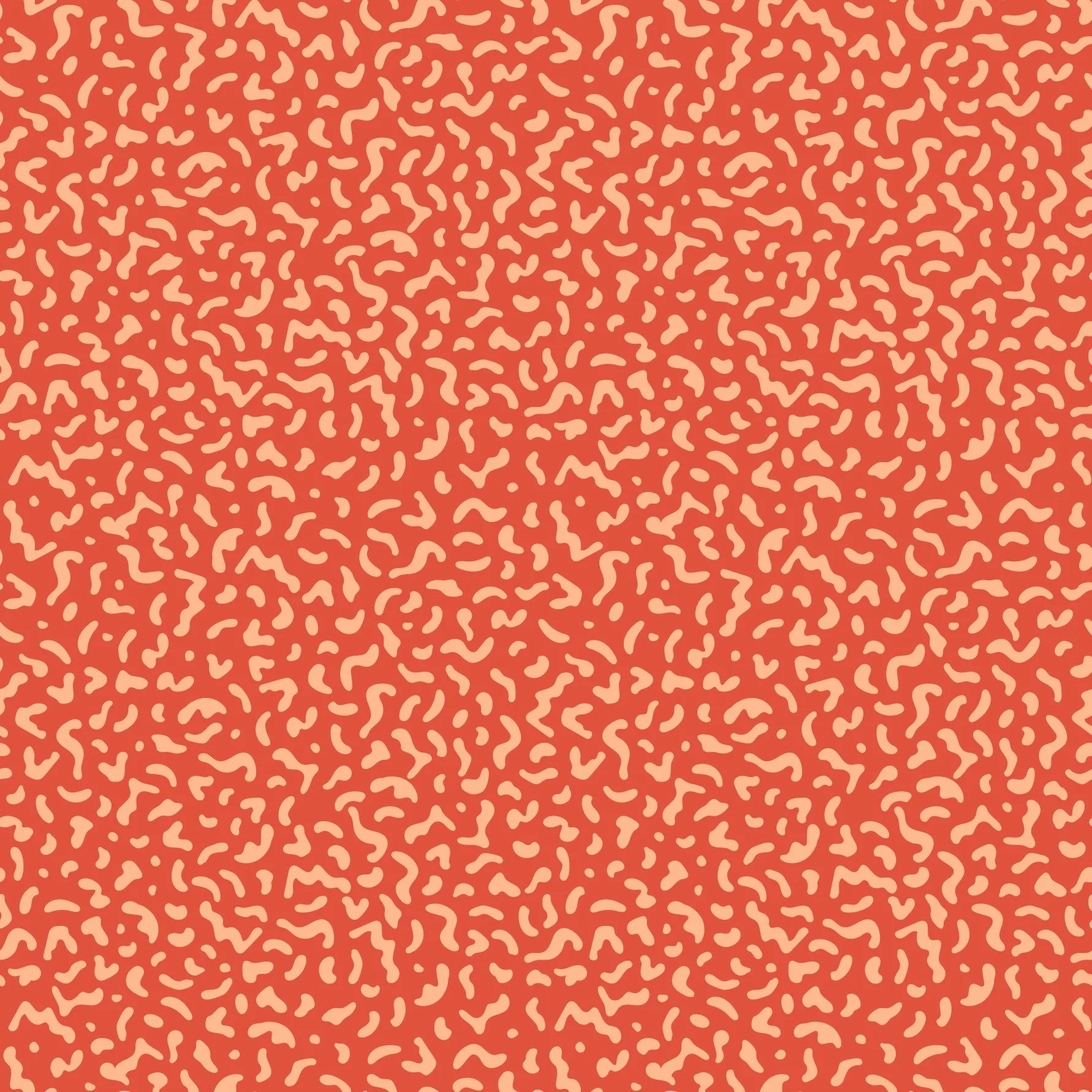
The brand pattern represents morsels, or crumbs, as a fun play on the brand name.
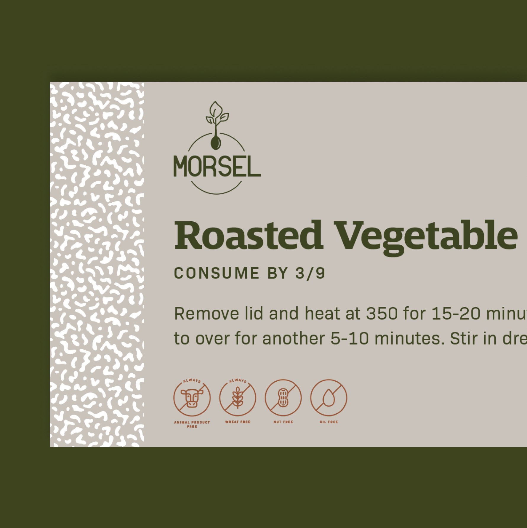
The pattern can be used on a micro scale or enlarged. It’s shown in this example of a meal label.
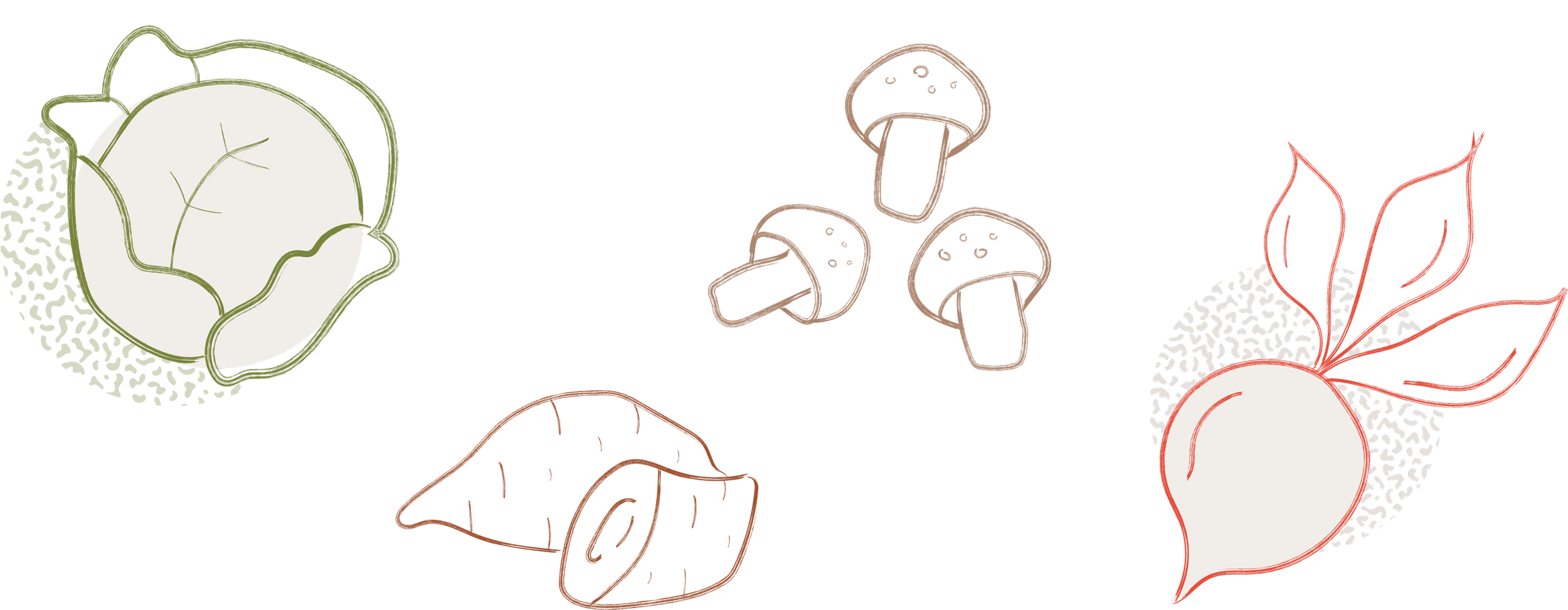
The brand illustrations bring in a hand-drawn feel, hinting at the handmade nature of the meals. The icon system — an important visual cue on each food label — is equally simple and linear without being hand-drawn.
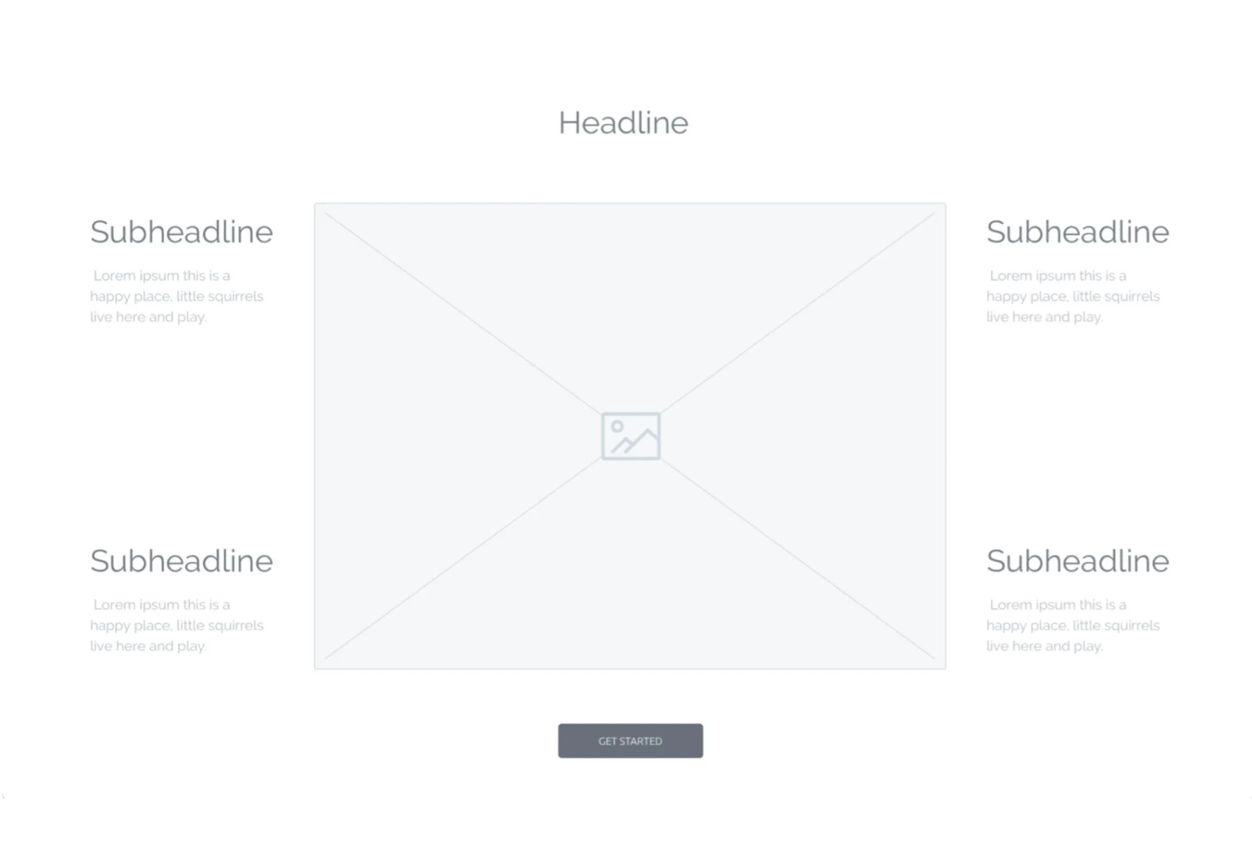
From Wireframe
Each page of Morsel’s website was carefully mapped out in wireframes, considering the user’s experience through the website.
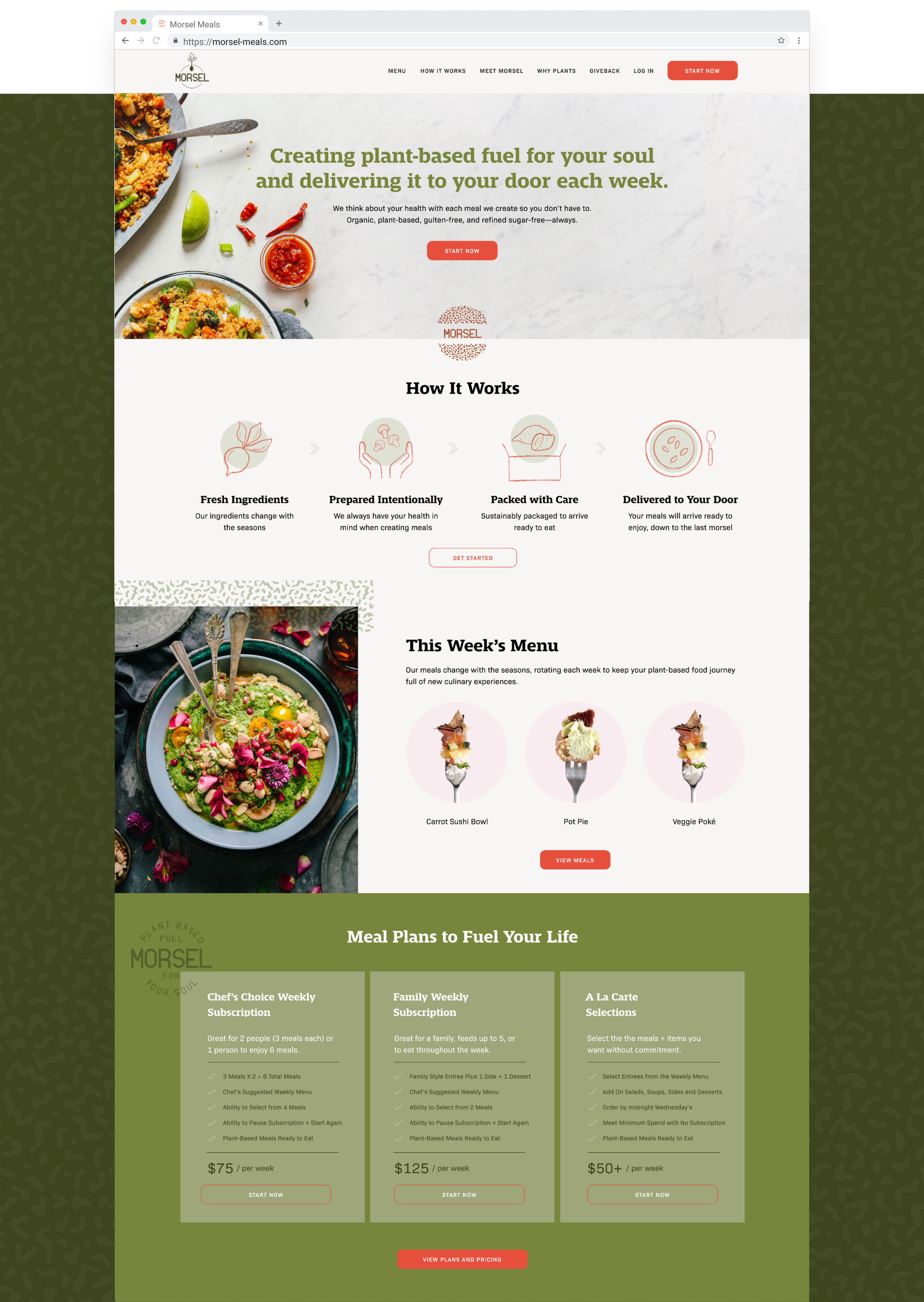
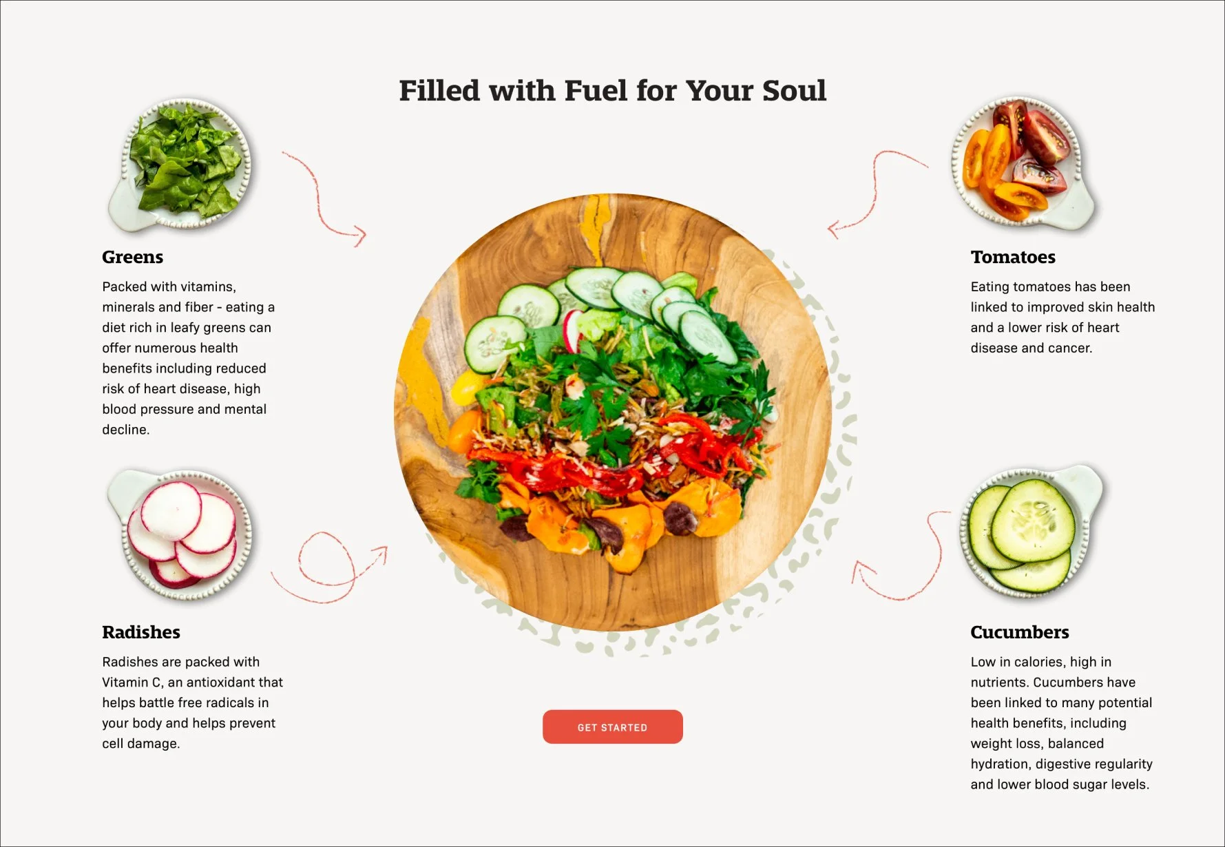
To Design
The wireframes were then turned into designs using the brand’s new visual identity.


