Nomad Be Happy
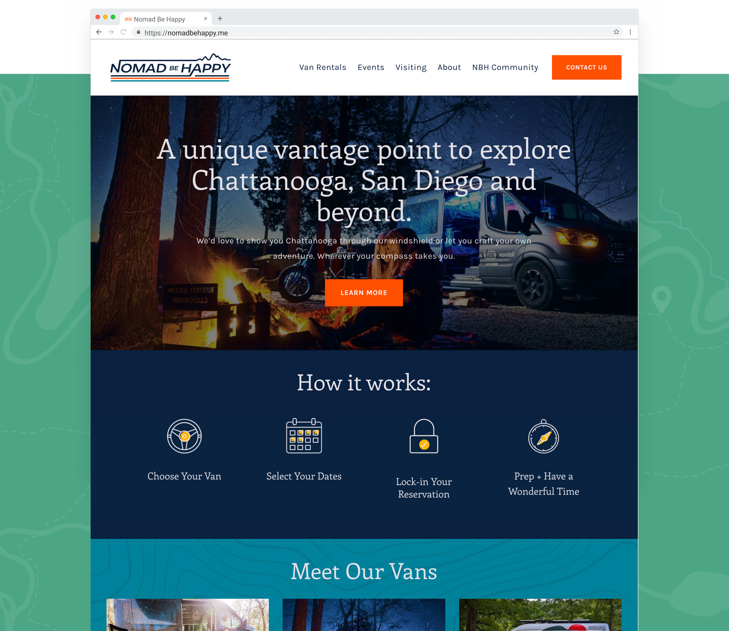
Nomad Be Happy came to us with a great brand name and vision for their van rental company that they wanted to position as a lifestyle brand among the van community. From digital to the physical world, their new branding exudes their values and spirit.
Created in collaboration with East Taylor Creative | Role: Creative Director & Designer

Primary Logo
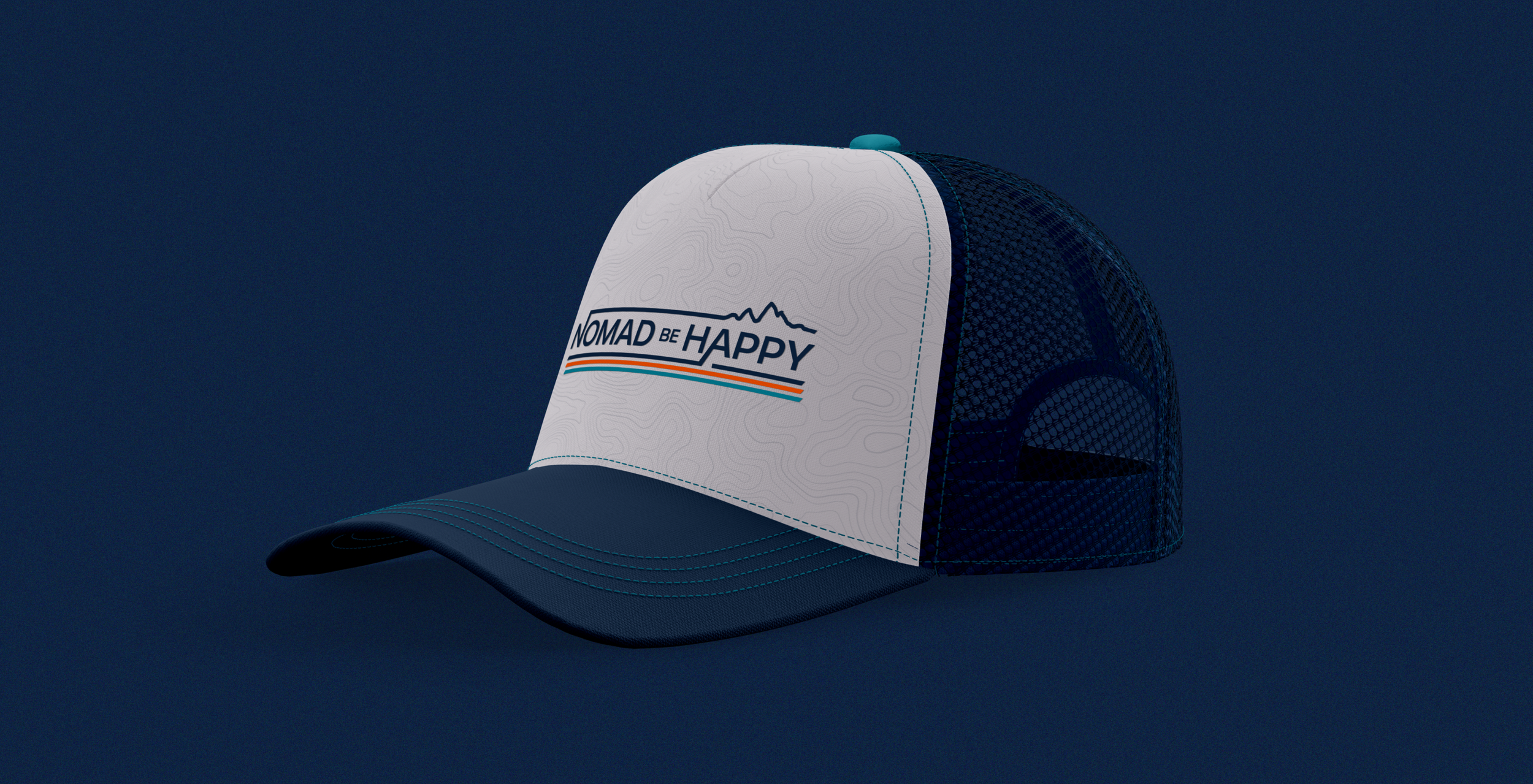
The Nomad Be Happy logo integrates easy-to-read typography with a set of lines, representing movement, and a mountain range, representing the terrain these vans will see.
Secondary Logo
The main logo can be reduced down to a secondary mark that still represents the brand while being more scalable for instances like a keychain.
