JKH Ceramics
Jennifer of JKH Ceramics came to us with a desire for a brand identity that represented her ceramics work — organic, handmade, and heavily inspired by coastal Georgia.
Created in collaboration with East Taylor Creative | Role: Creative Director & Designer
Logo
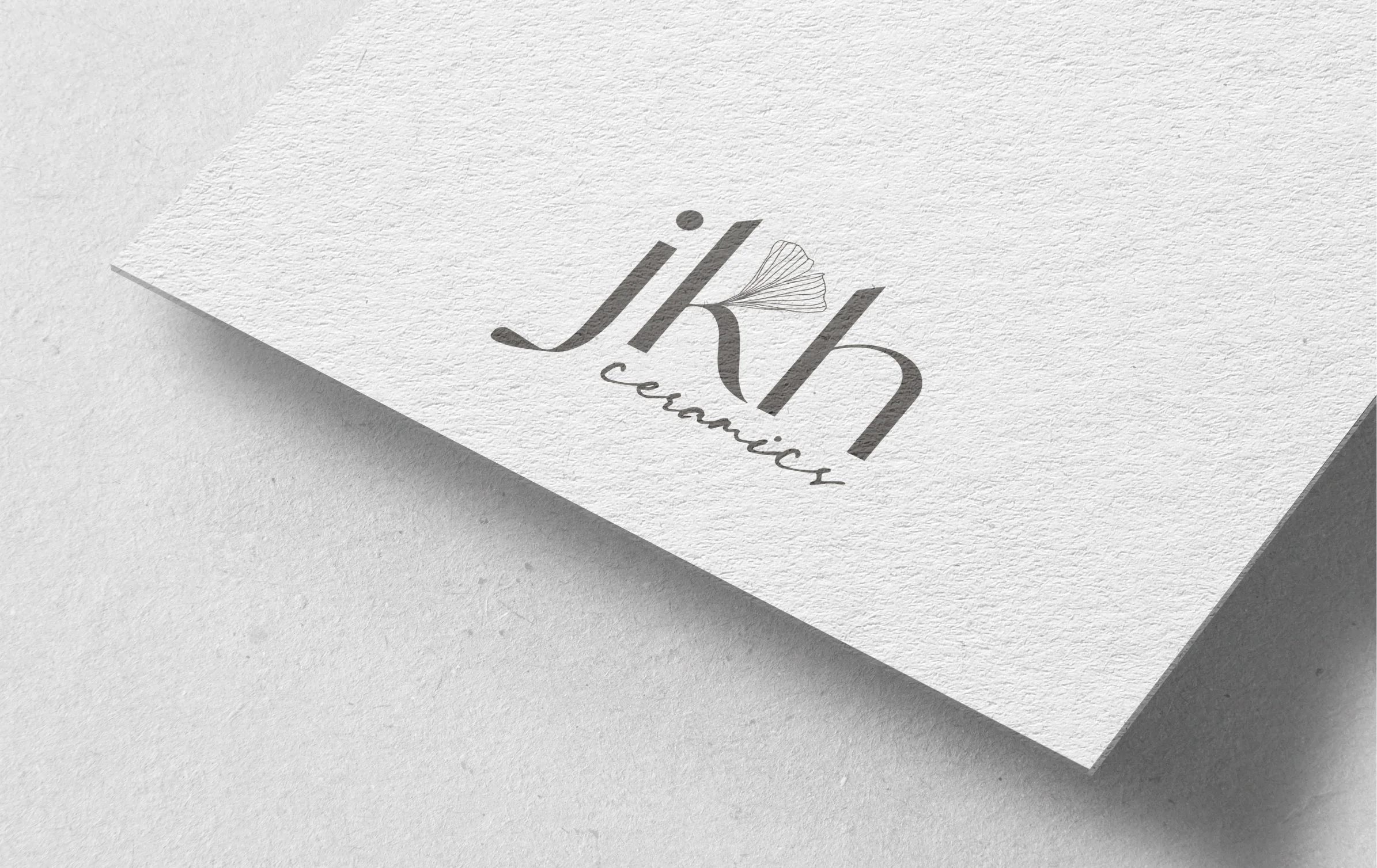
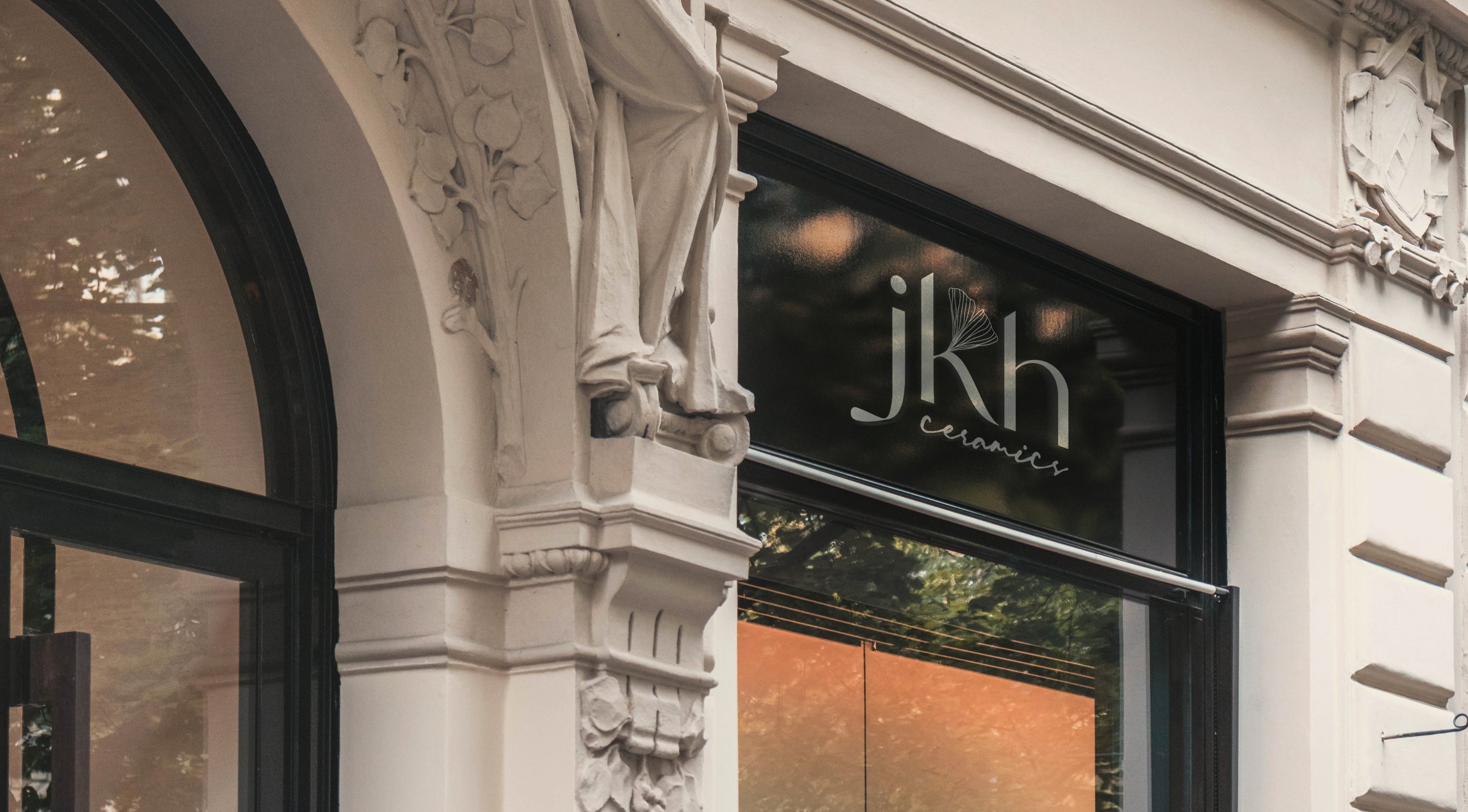
The JKH logo communicates communicates Jennifer’s initials and brand-name while the ‘k’ exhales a thinly stroked gingko leaf, a symbol of strength and longevity, both of which have made Jennifer the artist she is today.
Brand Mark
The gingko leaf can be broken from the full logo to create an easily recognized mark.
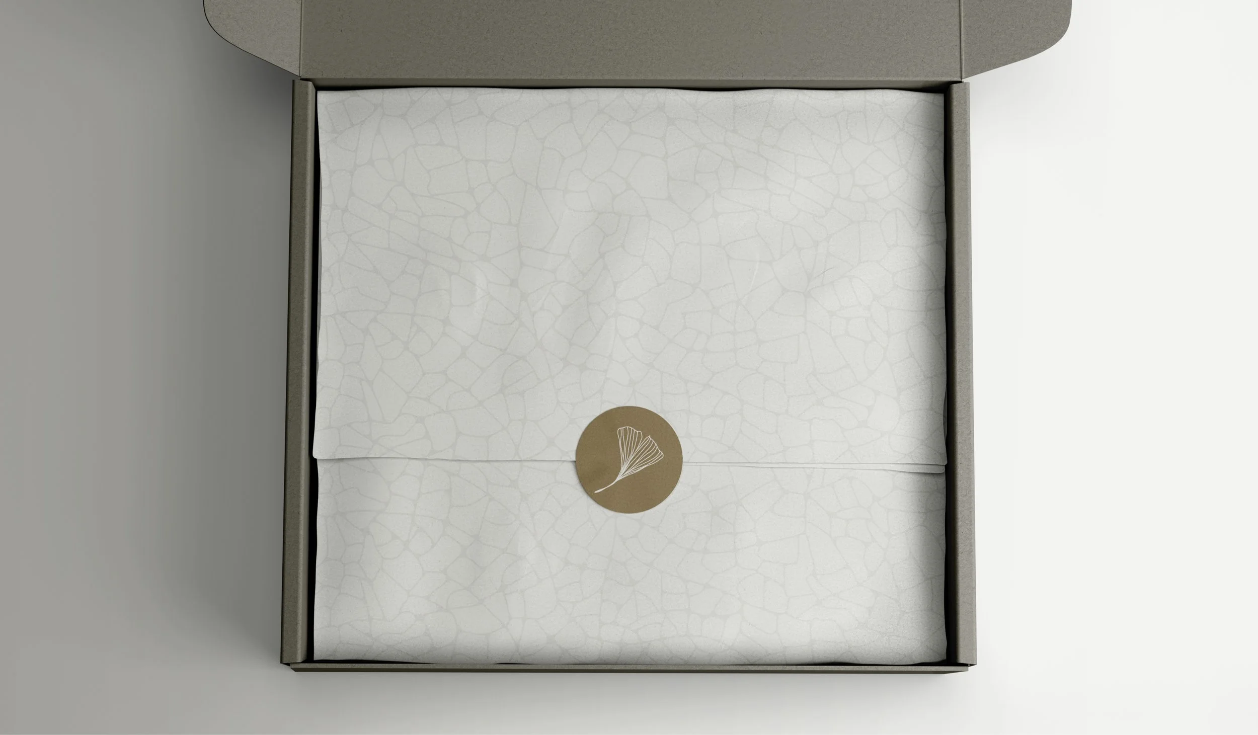
The brand patterns bring in elements of nature that are important to Jennifer, mimicking the essence of leaf veins, tree rings, and waves.
Typography
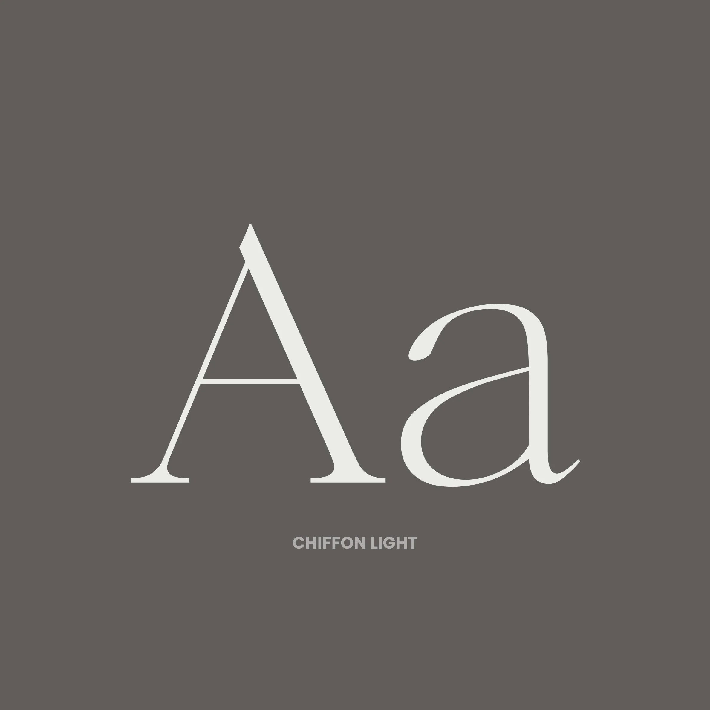
Chiffon Light serves as the brand’s headline font. The serif font is delicate, intentional, and approachable, just like JKH.
Font Heirarchy
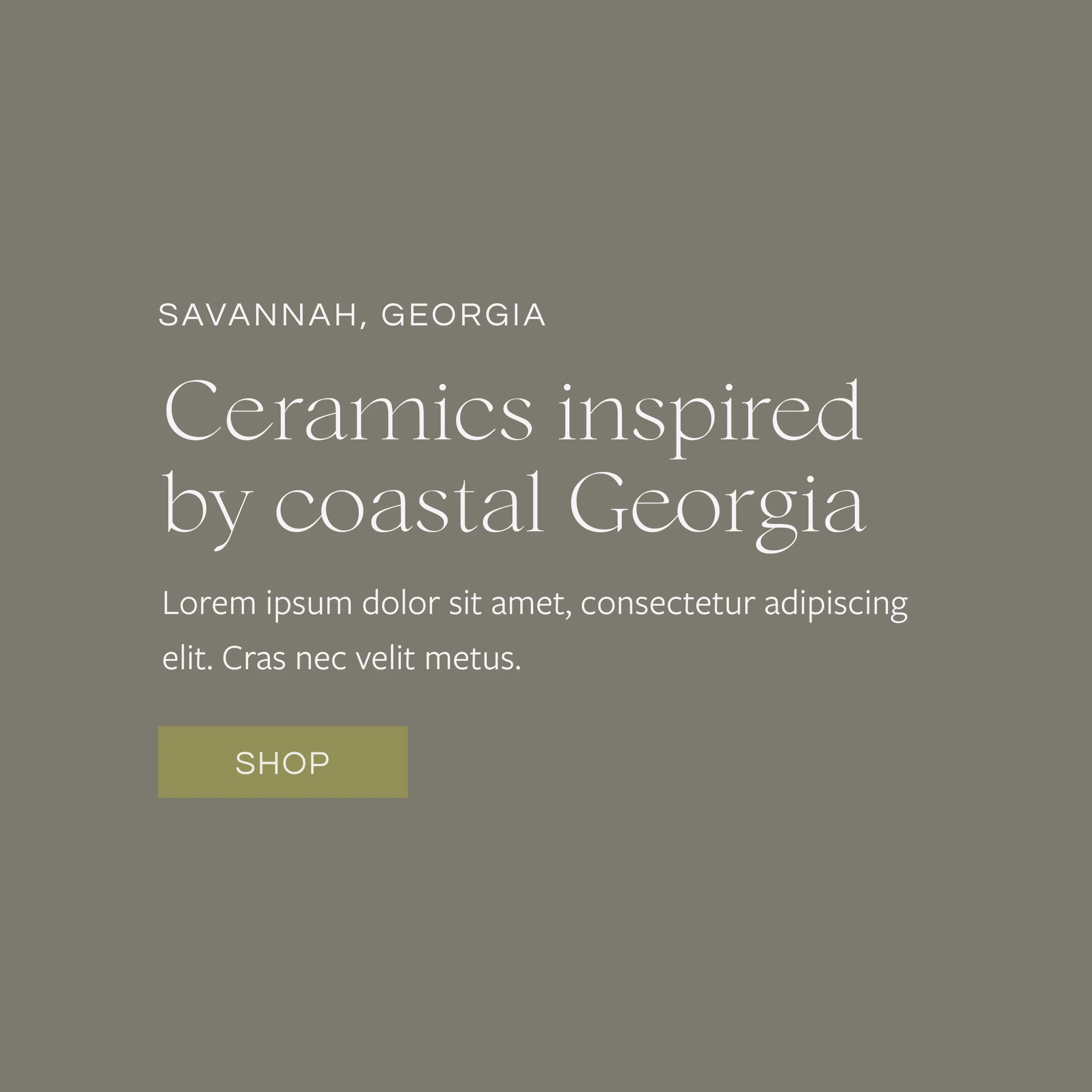
The brand fonts work as a system, pictured above.

